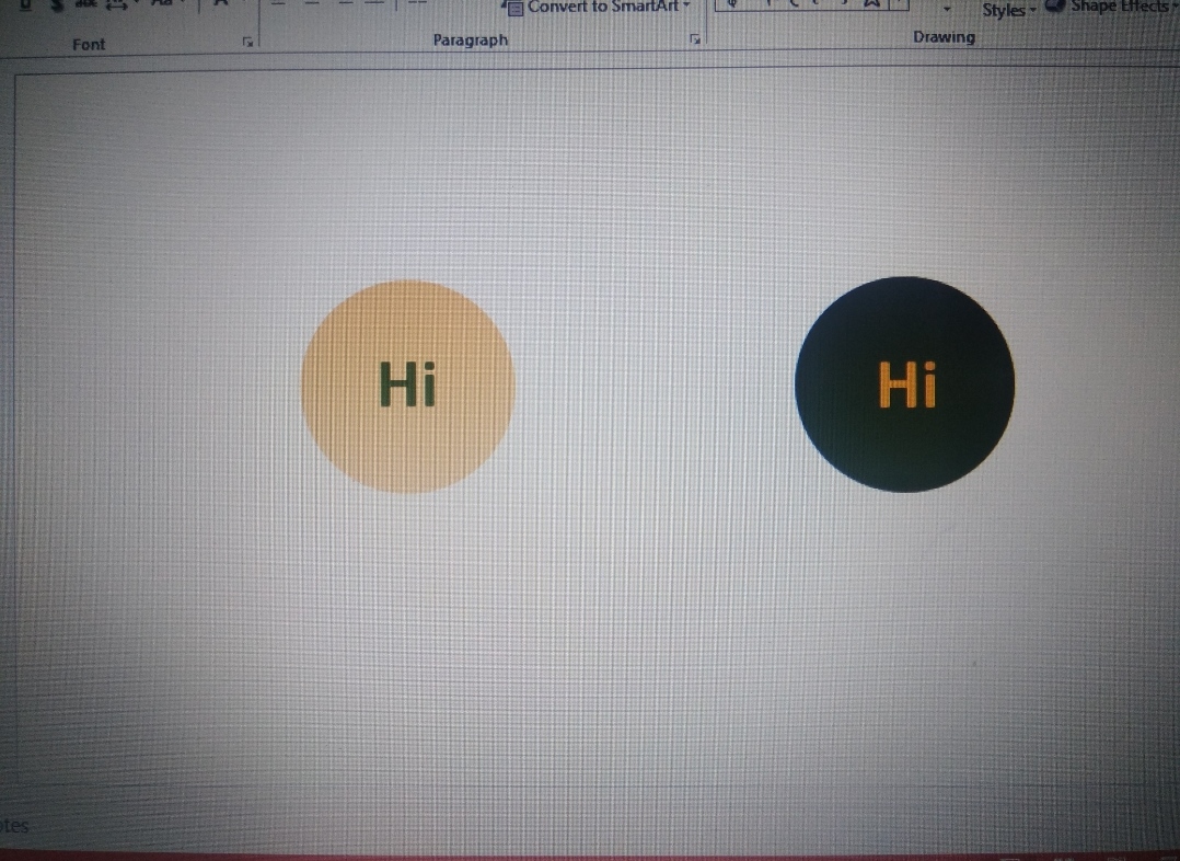
This was when i tried to show a frnd why colours are significant. Her social media page had a profile pic of type 1. A brand’s profile pic is the most repetitive element on social media and gives the maximum scope for brand recall. That said, it’s vital that the image first gets noticed and cuts the clutter to initiate brand recall. Forget the logo. It comes later. Getting noticed is of first priority. Colour contrasts are the ones that make it easy. Almost every social media page’s background os white. So the DP’s primary colour or the dominating colour should be a dark shade. Going inside the DP, the same principle applies. The logo’s colour should be in good contrast to the DP’s primary or background colour. Hence a lighter shade. So image 2 wins. In the end, my frnd was like.. Annanukku oru ooothapammmmmm… She was using dark mode and technically her choice to go with type 1 was absolutely right.. It’s all perspective. ☺️
Immortalizing Thoughts & Memories